Planning 2018 – Future Log Ideas
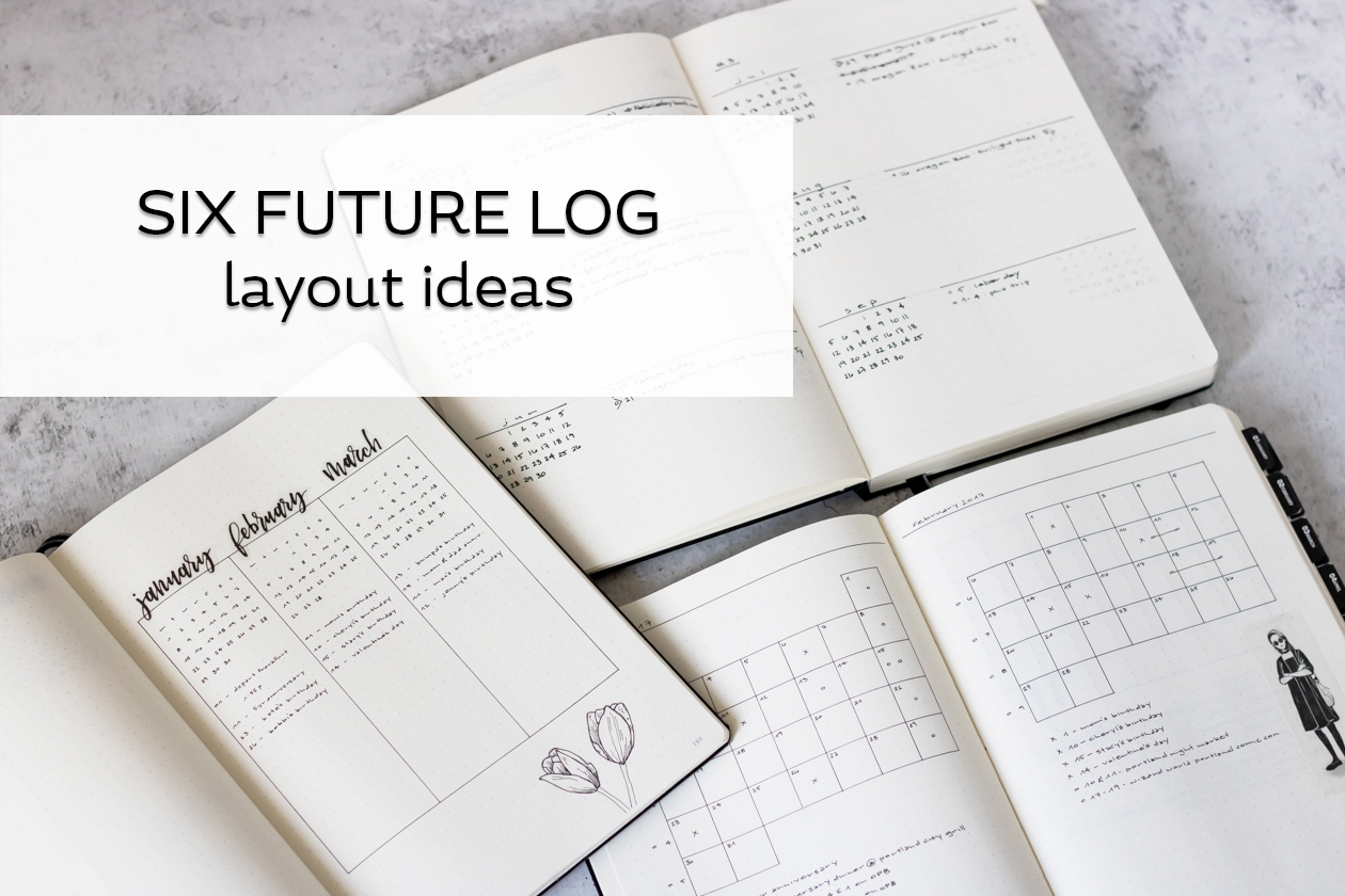
With 2018 quickly approaching, now seems like a great time to start planning out my bullet journal for 2018. I’ve decided to start with the feature that has been at the front of my journal since I started my very first journal: the Future Log. Future Logs are an important feature of bullet journaling, since they allow you to keep track of events, tasks, and deadlines that are too far in the future for your current layouts to capture.
There are unlimited options, when it comes to bullet journaling layouts, and future logs are no exception, but it is vital that your layouts work for you. I’ve seen so many beautiful options, but looking nice doesn’t necessarily mean it is functional. And it’s important to remember that functionality is different for everyone, as everyone’s needs are different.
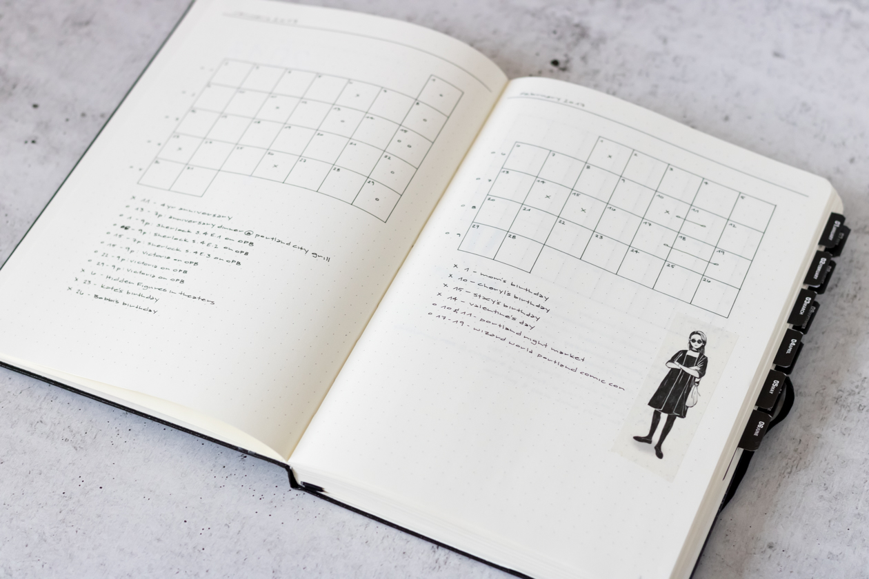
Since I really want to make sure my future log layouts for 2018 are going to be functional for me, I thought it’d be a good idea to take a look back at the spreads in my previous bullet journals and assess what has worked for me and what hasn’t. My 2017 future log layout is still one of my favorite layouts that I’ve put together. With a page for each month, it’s nice to have a calendar big enough to write in and plenty of space underneath for detailing events.
While I’ve liked using this layout, it also hasn’t been perfect for me. I think the calendar would work much better with color coded symbols, as the black blends in too much, making the entries less visible. I’m also really big on minimizing my footprint in my journal, and don’t like too much wasted space. Some months, I had so few entries, it felt like it wasn’t really worth dedicating an entire page to it. The month of September was the only month I really utilized the whole page.
I think this layout would be really great for someone who likes to use color coding and has many events to plan for in their future log. For me, I don’t think it will be the right choice going into the new year.
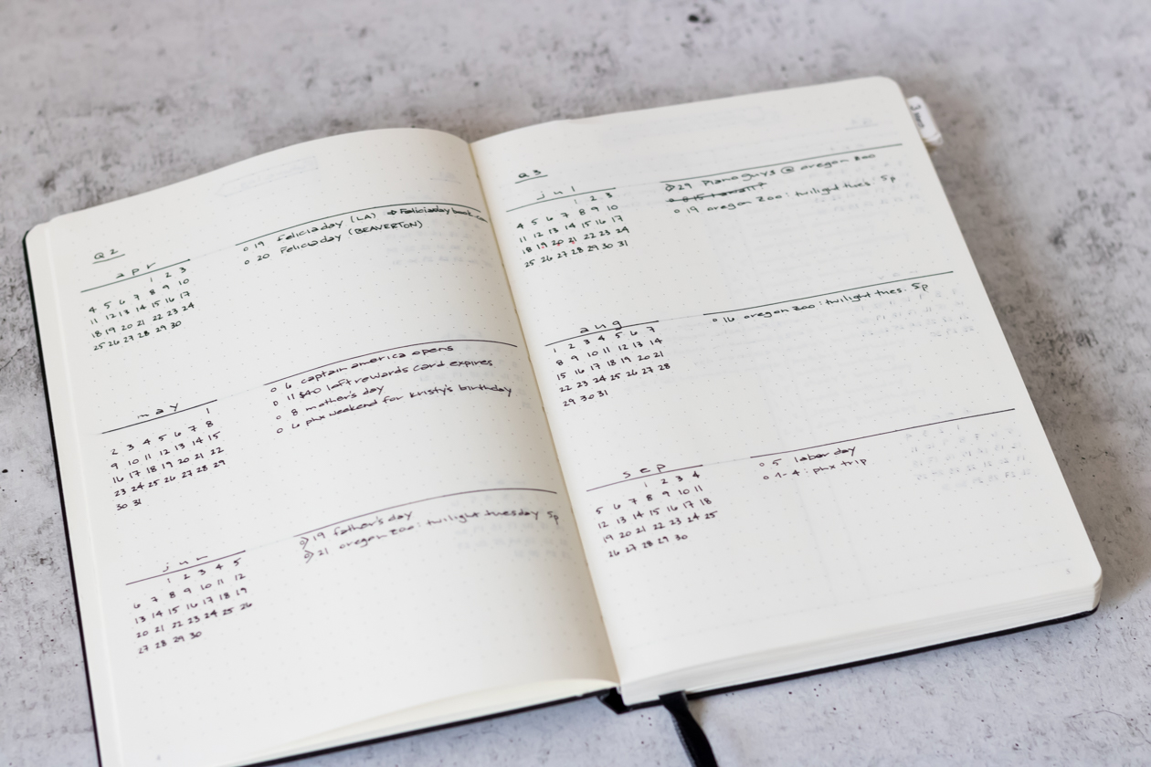
The reason I created my 2017 future log the way I did was because I wanted to make changes to the one I used in 2016. This was my first bullet journal, and I kept it pretty simple: small calendars for each month with space alongside for detailed entries, broken up by quarter. While the future log layout actually worked pretty well for me, I distinctly remember being afraid to add minor things to it because I was worried I’d run out of space. As a result, I hardly used it in 2016.
Having multiple months on one page is really nice for conserving space and for seeing many things at once, as long as there is enough room to fit everything that needs to fit. Because my 2016 calendar lacked enough space, I over compensated in 2017, but a mix between the two layouts may be just right for me in my third year of journaling.
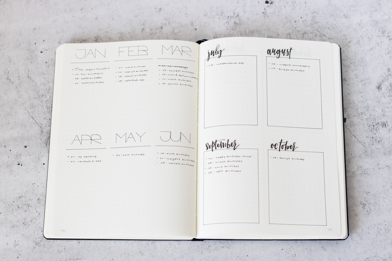
To start mapping out potential layouts for my 2018 future log, I pulled out my handy practice journal. I started by going in the complete opposite direction from having each month on one page, and see how many months I could fit on one page while still having enough space to add events. I kept it super minimal and put six months on one page. This layout would allow you to see the entire year at one glance on a two page spread.
While seeing everything at once would be really nice, the columns felt too cramped for me. I found myself condensing the info I wanted to add to a bullet or running off the edge of the page because I misjudged how much space a word would take up. My second attempt kept the same idea, but moved down to four months on the page instead of six. I also added boxes to work within, since the openness of the previous layout made it harder to stay in the lines for me. With more space for each box, this layout is much more comfortable to write in, and you can still see many months at a time.
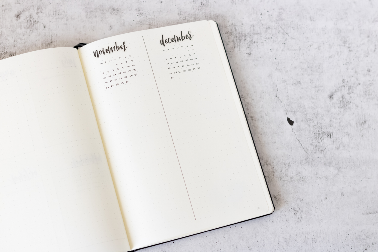
I thought the four month layout was a great option, but there was still something missing. I wanted to see the calendars I had in some form in the past, and with four months on a page I thought it would get too cramped to add them. I thought I’d take another stab at a minimal layout that would offer me both a calendar and plenty of room to write in. Going down to two months per page, I kept it super simple with the page split down the middle and a month on each side. This gives me plenty of space to add a nice title, a calendar, and as many entries as I’d like to add.
I would still be able to see four months at a time with this layout, which is really nice, but I’m worried about it offering too much space at the same time. The counter to that is, the extra space allows for a cleaner, less cramped look, which I’m always a fan of.
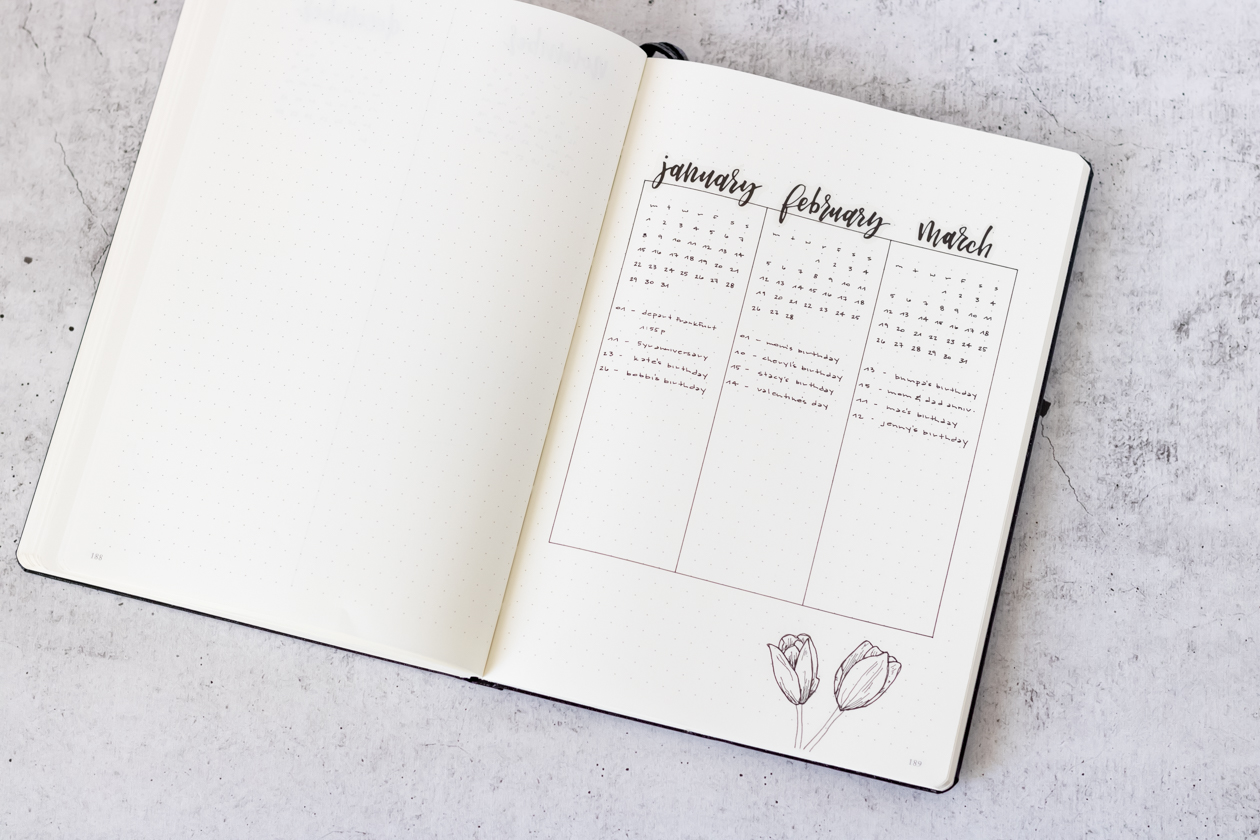
Still unsure I was going in the right direction, I decided to merge some of the ideas from the layouts I’d put together and try something different. By mixing the boxes from one layout, the columns and calendars from others, I put together a layout with three months on the page. A full spread of this future log would allow me to see half the year at one glance.
The boxes help keep entries contained, though they are still a little tight. Having the calendars for each month is really nice as well. I didn’t use the full span of the page, as I thought the columns would be tall enough and I could use the extra space at the bottom for notes or embellishments. It’s a visually appealing layout, for sure, and I think it would be really nice to have only two two-page spreads for my entire future log.
Every one of these future log layouts is a good option. While I’m not yet decided on which direction I’ll go, it’s been really helpful testing out some options. If you have a future log layout that you love, leave me a link to it in the comments down below, or let me know which one of these you like the best!

thanks for this !! starting my journal today. ive been keeping notes in my phone until i do. it’s so hard to pick a design !!!!!
I ended up going with the 6 month spread (3 months per page) for my own future log this year. But I totally agree, it took me a while to figure out which design I was going to commit to!
Love these! You are a bujo artist! I like the one with three per page, personally – you’re giving me ideas for my own bullet journal.
Thank you, you are too nice! I also really like the look of the three per page layout, but I’m worried it will be too cramped. But I’m glad your taking away some ideas!
So many beautiful options! Cheers to the new year
Thank you!